Styling & Themes
The Style tab controls how your widget looks and where it sits on the page. Changes preview live in the canvas without publishing.
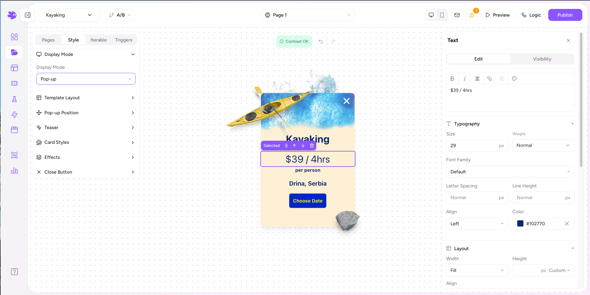
Display Mode
Three options:
- Inline — the widget renders inside the <div data-jule-project> container wherever you placed it in the HTML. Ideal for embedded forms, landing pages, and preference centers.
- Popup — renders as a fixed overlay regardless of where the container div sits. Position options: center, bottom center, bottom left, bottom right, and slide-in from the side.
- Banner — renders as a full-width bar anchored to the top or bottom of the viewport. Stays visible while the visitor scrolls. Ideal for announcements, cookie notices, and persistent calls to action.
The embed snippet in the Style tab updates automatically when you change the mode. Copy the snippet and paste it into your site.
Template Layout
- Default — single-column card. The standard layout for most widgets.
- Two Column — splits the widget into left and right columns. Useful for image-plus-form layouts, like a hero image on the left and opt-in form on the right.
Two Column Settings
When Two Column is selected, additional controls appear:
- Left/Right column width — percentage split (e.g. 40/60).
- Column gap — spacing between the columns.
- Per-column background — solid color or image, independently set for each column.
- Object fit — Cover or Contain for background images.
Card Styles
Controls the outer card that wraps the widget content:
| Property | Options |
|---|---|
| Background color | Any hex or rgba value. Supports full opacity. |
| Border radius | px value. 0 = square corners, 16+ = pill-like. |
| Border | Width, style (solid / dashed / none), and color. |
| Padding | Inner spacing. Separate values for single and two-column layouts. |
| Max width | Caps the card width. Leave blank to fill the container. |
| Shadow | None, Small, Medium, or Large presets. |
Effects
Popup-only settings:
- Overlay opacity — dims the page behind the popup (0–100%).
- Overlay blur — blurs the page content behind the popup.
- Entrance animation — fade, slide up, slide in from the right.